Design Story
"A typeface or graphic design is never completely neutral; it is always an expression of its time."
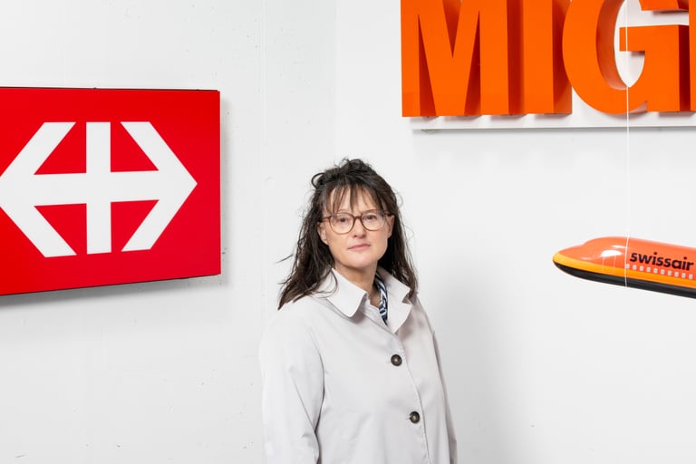
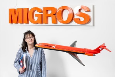
Whether on train station signs and posters or in company logos and digital headlines: We encounter the Swiss Style every day. Barbara Junod, Curator of the Graphics Collection at the Museum für Gestaltung Zürich, explains why Zurich became a hub for graphic design and typography, how Swiss Style shaped international design, and why the fascination with Helvetica continues to this day.
Zurich is considered an international hub for graphic design. What historical, cultural, or educational factors have contributed to the City of Zurich’s development into such an important center for typography and visual communication?
The strong reputation that graphic design and typography from Zurich enjoy is based primarily on solid vocational training and professional practice. As early as 1920, the Zurich School of Applied Arts (now ZHdK) introduced a specialized graphic design program—a day school with integrated typography instruction. However, there was also the option of a practice-based vocational apprenticeship, which still exists in Switzerland today. The Swiss Werkbund also played an important role, as it promoted modern architecture and functional design and contributed to the development of modern graphic design and typography. Thanks to Switzerland’s relative immunity from the two world wars, the refuge it provided to pioneers of the international avant-garde, and the Swiss designers who built upon their legacy, these fields were able to evolve into the Swiss Style, which spread worldwide beginning in the 1960s.
Is it true that Helvetica and Univers were created in Zurich?
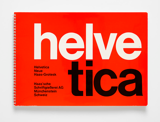
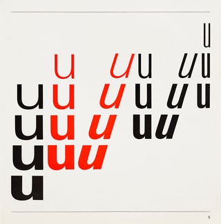
Yes and no. The Zurich typesetter and businessman Max Miedinger developed Helvetica—which was then still called Neue Haas Grotesk—together with Eduard Hoffmann, the director of the Haas type foundry in Münchenstein near Basel. It was released there in 1957 in only a limited number of styles for hand typesetting. In the same year, the Deberny & Peignot type foundry in Paris launched the Univers typeface family—developed by Adrian Frutiger— for lead and phototypesetting. What connects these two sans-serif typefaces to Zurich is the early conceptualization and design of both. Both Miedinger and Frutiger attended continuing education courses in type design at the Zurich School of Applied Arts, where Walter Käch taught the design of sans-serif typefaces beginning in 1940. It was here that Frutiger sketched an alphabet that he later drewupon for Univers. Both Univers and Helvetica display characteristics of Käch’s typeface designs: for example, the horizontal curved terminals, the square dots above the “i,” and the visually balanced weights.
Helvetica quickly became one of the most widely used typefaces in the world. What made it such a perfect fit for the spirit of the times, and why was it more successful than Univers?
With its clean, modern style and compact, balanced typeface, Helvetica captured the spirit of the time. There was a demand for new sans-serif typefaces. The geometric Futura was no longer in vogue, and the popular Akzidenz-Grotesk from Berthold AG in Berlin had become outdated. Although other sans-serif typefaces entered the market alongside Helvetica and Univers, the versatile Helvetica surpassed them all. Easy to set and highly versatile, it fulfilled the practical needs of both designers and printers. Starting in the 1960s, it shaped the visual identity of international companies such as Lufthansa, American Airlines, and the German chemical company BASF. This trend continues to this day. Univers was also internationally successful: for years, it was Fiat’s corporate typeface, was used for the Olympic Games in Munich, and became the flagship typeface of Deutsche Bank. However, there were delays in distribution, and Frutiger created new typefaces such as Frutiger, which became widely adopted in signage worldwide.
To what extent is the history of Helvetica and Univers linked to the overall development of the Swiss Style in graphic design?
They are closely linked, as these sans-serif typefaces were a central design element in constructive graphic design. Helvetica owes its early popularity to the Zurich graphic designers Josef Müller-Brockmann and Hans Neuburg. Not only did they champion Helvetica in their international journal Neue Grafik in 1959, but they also designed handy typesetting guides and type specimen books on behalf of the Haas Type Foundry and later used Helvetica themselves. However, depending on the situation, Akzidenz-Grotesk remained their favorite typeface. The exponents of the Basel School, on the other hand, preferred and promoted the elegant rival typeface Univers.
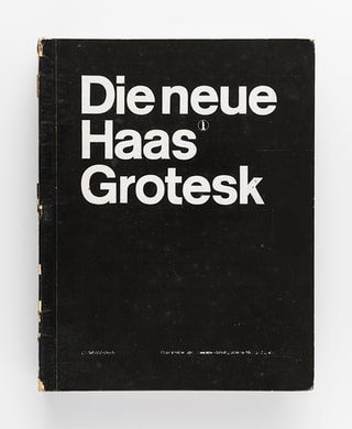
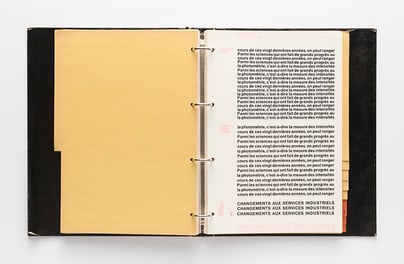
“The different preferences of the people of Zurich and Basel are also evident in graphic design: Zurich’s graphic design was formally austere and grid-based, while Basel’s allowed for free-form designs. Both trends are part of the Swiss Style.”
The Museum für Gestaltung houses a significant archive on Swiss graphic design. What materials related to Helvetica or the Swiss typographic tradition can be found in the museum’s collection?
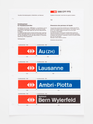
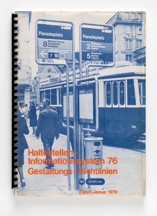
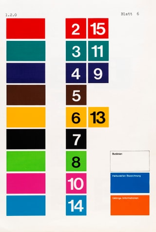
Our collection includes the aforementioned Helvetica typesetting samples and type specimen books from the Haas Type Foundry, as well as numerous examples of Helvetica’s use on posters, in advertisements, brochures, shopping bags, and signage. Well-known is the Visual Information System of the Swiss Federal Railways (SBB), developed by Müller-Brockmann and Peter Spalinger starting in 1978, for which they used a modified version of Helvetica. We have the manuals containing the guidelines, the designs for the lettering and pictograms, as well as a red SBB station lighted sign with a white double arrow. A semi-bold Helvetica is also used in the information system of the City of Zurich Transport Authority (VBZ), which was developed by Ernst and Ursula Hiestand starting in 1976. Both information systems remain in use today. The museum holds the complete archives of these designers in the field of graphic design, as well as the estates of Swiss graphic designers such as Hans Neuburg, Nelly Rudin, and Wolfgang Weingart, and that of type designer Adrian Frutiger.
Designers such as Josef Müller-Brockmann and Armin Hofmann helped shape modernist graphic design. How important were these figures to the visual language that Helvetica would ultimately come to represent?
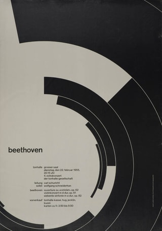
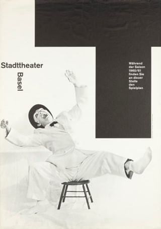
With their cultural posters, both designers became figureheads of the Swiss Style: Müller-Brockmann with his constructivist, concrete, grid-based posters for the Tonhalle Zurich, and Armin Hofmann with his abstract, symbolic black-and-white posters for the Kunsthalle and the Stadtheater in Basel. Both designers used sans-serif typefaces in their graphic design work, incorporated photography as appropriate, and created dynamic compositions. In addition, both were active as educators and published textbooks that were read worldwide. Hofmann’s teaching career in Basel, however, lasted much longer than Müller-Brockmann’s in Zurich. In contrast, Müller-Brockmann and his agency handled extensive projects in corporate design, trade show design, and wayfinding.
Helvetica is often described as neutral, rational, and timeless. But can a typeface ever truly be neutral, or does Helvetica, too, embody a strong cultural identity?
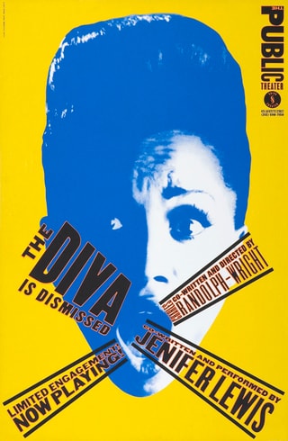
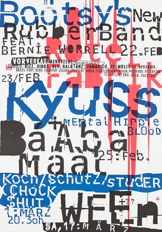
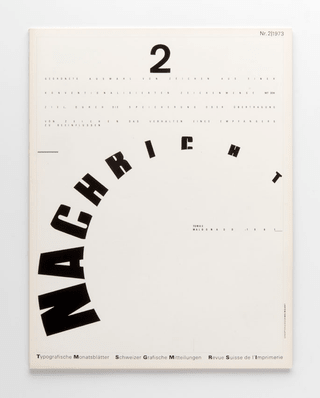
A typeface or graphic design is never completely neutral; it is always an expression of its time. This also applies to Helvetica and the ways it is used. Nevertheless, this typeface—whose character set has been continuously expanded and adapted to current typesetting techniques—is more than just a style. It embodies a rational approach that is essential for the development of complex visual identities, infographics, wayfinding systems, and user interfaces. As Helvetica became too dominant in the wake of digitalization, a sense of saturation set in. Less rigid typefaces such as Meta and Rotis entered the market. In the cultural sphere, Helvetica was considered too “clean” and lacking in character. Designers such as Wolfgang Weingart, Paula Scher, David Carson, Cornel Windlin, Stefan Sagmeister, and many others sought a personal style of expression. This even extended to hand-drawn typefaces.
In recent years, interest in the Swiss International Typographic Style has grown once again. Why are contemporary designers looking back to this modernist visual language?
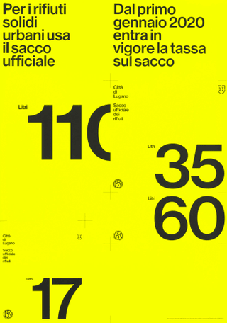
They are looking for structures on which to build. Studios such as Experimental Jetset in Amsterdam and Studio Norm in Zurich appreciate the merits of the Swiss Style with its clear rules. Designers of the next generation, such as the studio Unstated (Leonardo Angelucci, Sabrina Cerea), founded in Zurich in 2022, are also embracing this trend. The works we recently acquired from them feel fresh and contemporary. It’s no coincidence that Unstated often uses Helvetica. It’s also featured on the red trash bag for Lugano. It embodies the same “clean” spirit as the blue Zurich bag. Whether it’s trash bags, Tupperware, outdoor clothing (The North Face), or Japanese goods (Muji)—the unpretentious Helvetica is particularly well suited to such applications.

How does the Museum für Gestaltung Zürich contribute today to preserving and promoting the legacy of Swiss graphic design and typography?
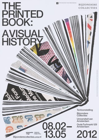
Our museum fulfills its public mission by continuously expanding its graphic design collections, preserving them for future generations, researching and documenting them, presenting them through exhibitions, publications, and workshops, and making its collection database continuously accessible online. We are also committed to preserving intangible cultural assets such as cultural knowledge and creative processes—for example, through oral history interviews in which designers discuss their work. For several years now, we have also been collecting animated posters and digital typefaces developed based on analog type specimens from our collection.
"We are committed to preserving intangible cultural heritage, such as cultural knowledge and creative processes."
What makes the museum such an important place for design enthusiasts to understand the history of typography and Swiss graphic design?
I recommend that you visit our permanent exhibition, which is updated every two years: Swiss Design Collection at the Toni-Areal. In a spectacular presentation, graphic design and typography come together with photography, decorative arts, and product design. Thematic displays in showcase drawers invite visitors to explore the originals on their own and contextualize them historically. The displays feature graphic and typographic works by Josef Müller-Brockmann, Hans Neuburg, Nelly Rudin, Wolfgang Weingart, Hans-Rudolf Lutz, Adrian Frutiger, and other Swiss designers. Those who’d like to try their hand at design can do so in the on-site studio, either on their own or as part of a workshop.